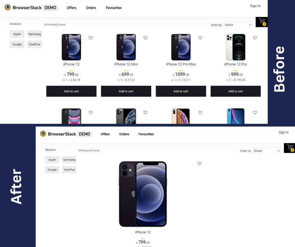
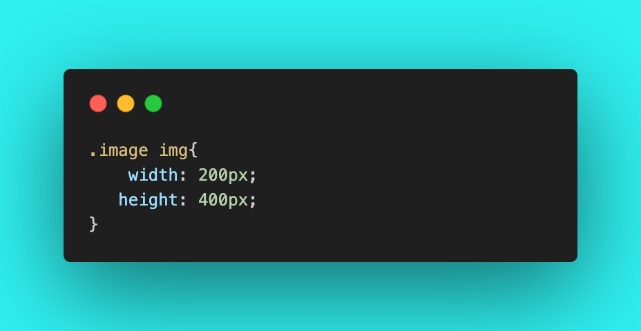
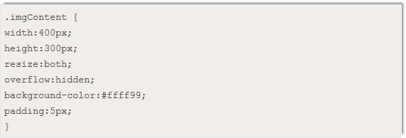
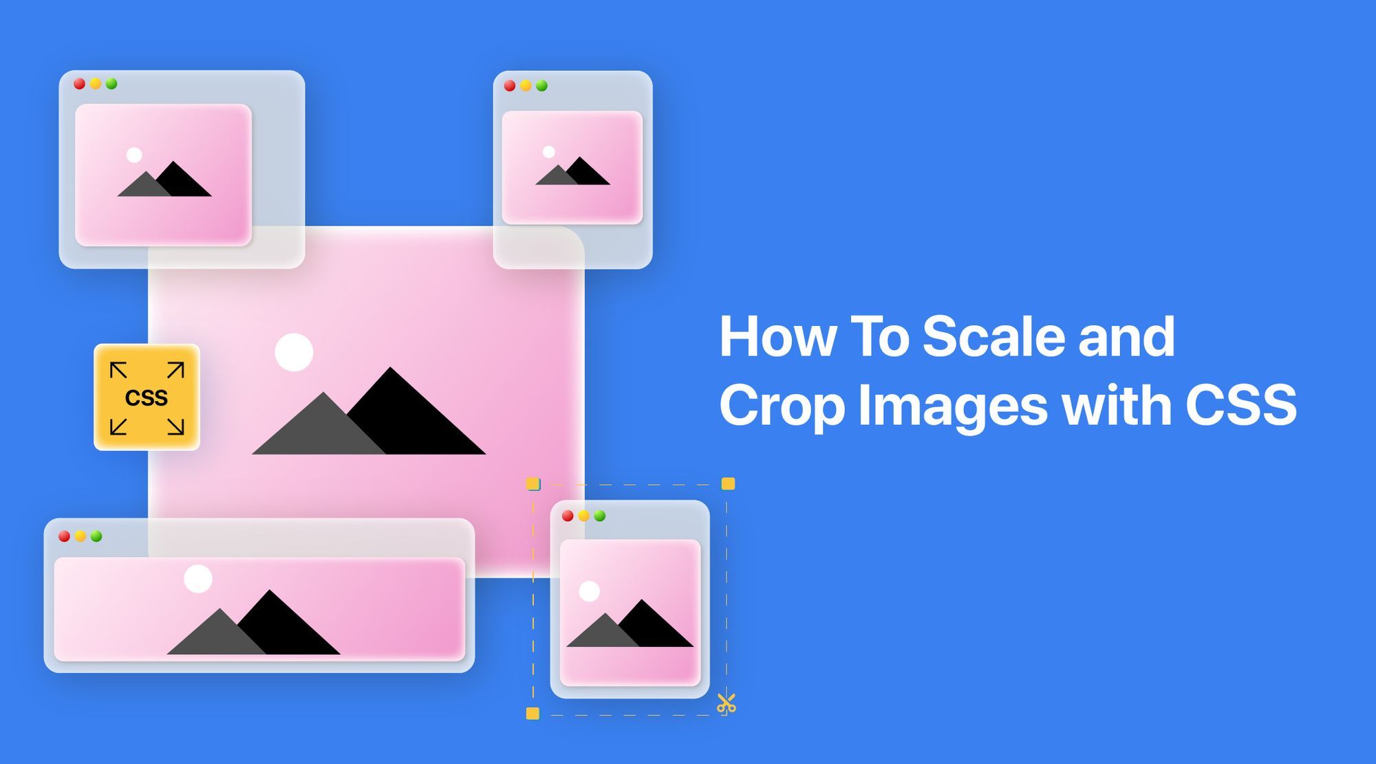
Resizing images with CSS is essential for responsive web design. Use properties like `width`, `height`, and `object-fit` to control dimensions. Set `max-width: 100%` on images to ensure they scale within their parent container while maintaining aspect ratio, offering a seamless user experience across devices.